To make data viz more accessible, we first need to understand assistive technology
Originally published by invitation on Nightingale, the Journal of the Data Visualization Society, on May 21, 2020, for Global Accessibility Awareness Day.
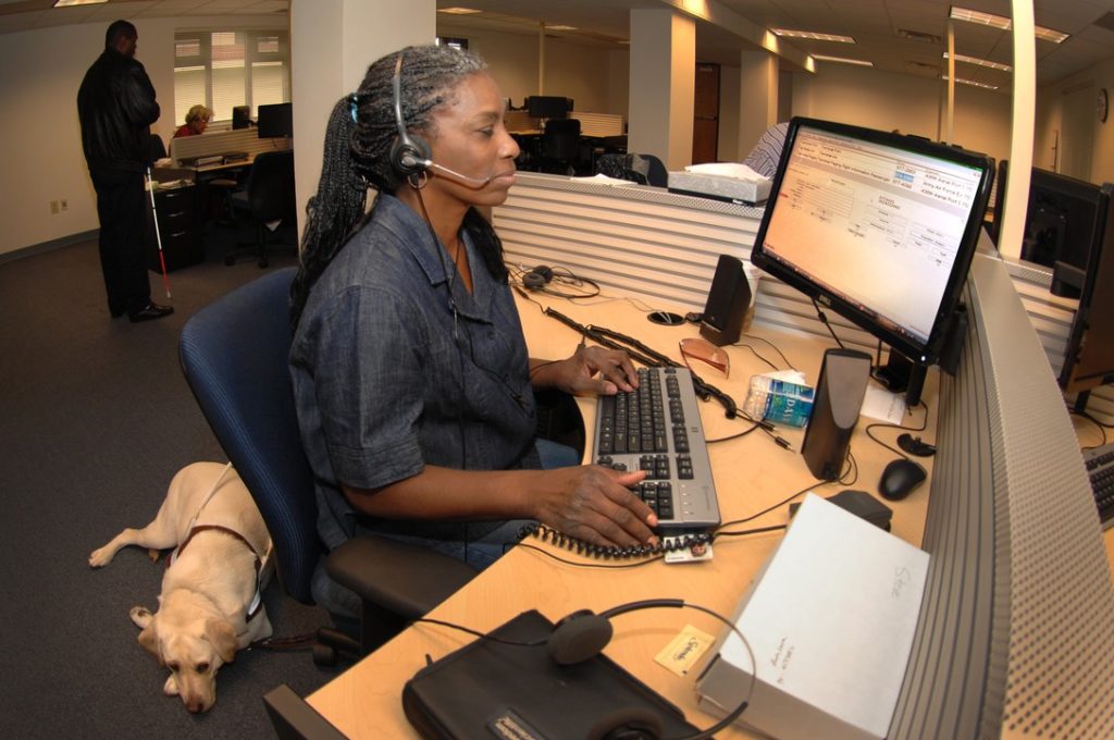
When I tell people I make data visualizations for blind people, the response is almost inevitably a quick pause while the gears of their mind start spinning wildly, then “How does that work?”
I’m not going to tell you how I do it. (At least, not in this article.) But I will tell you how I think about it, and suggest how you can too. Many people love data visualization because it makes data and other complex information accessible. But there are many people for whom data viz doesn’t make things accessible, and it’s not because they don’t understand data.
For example, data viz has played a critical role in educating people about COVID-19. But have you wondered how blind people are getting detailed information about the pandemic, given that so much of it is in chart or infographic form? The answer, for the most part, is that people with visual impairments are simply not afforded access to that critical data. To understand how we can—and must—change that, we first need to understand assistive technology.
Assistive Technology
Assistive Technology, or AT, is pretty much what it sounds like: technology that helps people overcome a constraint in how they interact with the world. In the case of people with a visual disability, that often means using a screen reader. A screen reader is software that literally reads text from the screen, a bit like an interactive audio book where the user can change the pace, skip passages, find text, or jump to sections or links they’re interested in. It also describes the structure of the text, like headings or tables or lists. But the caveat is that it only reads text, so if there’s something on the screen that’s not text, it’s hidden from them. Some non-text things have built-in descriptions, like form fields or buttons or links, which are announced along with their text labels. So images need text descriptions, called alt text, and complex images like charts need effective text descriptions to be useful to a screen reader.
Or course, visual disabilities aren’t the only ones to consider, but for a primarily visual medium like data visualization, blindness is the obvious design constraint. Not everyone who has a visual disability uses a screen reader, and not everyone who uses a screen reader has a visual disability. And fortunately, text (which includes numbers) is a remarkably robust and transformable container for meaning, and works well with many types of AT. So providing a text equivalent is usually a great starting point.
The dirty little secret of accessibility is that there’s no single correct way to make your content accessible, and no one-size-fits-all solution … and this also applies to make your charts, graphs, and diagrams accessible. You need to consider your audience, and what you’re trying to convey, and decide how you want to convey the information to them.
The good news is that this is business as usual for someone skilled in data visualization. You don’t just take every dataset and render it as a bar chart, and call it a day. You think about the message you’re trying to send, and you pick the correct chart type, the right subset of the data, the correct framing, the clearest symbols, and the pithiest prose to craft your message. You adapt, remix, and innovate.
What I do, and what I’m asking you to do, is to bring the same craft of data design to accessibility as you do to visual representation. True accessibility means telling your data story to everyone.
When I work on making an accessible dataviz, here are some principles I focus on.
Value your reader’s time and attention
Use alt text to provide a one-sentence summary of the chart. One of the benefits of a dataviz is that it can convey a complex idea with a small investment of effort on behalf of the reader. If the fastest, best way to provide information were to use a data table, then you wouldn’t have used a chart. Please don’t make your readers walk through each cell of a table to get the gist of what you’re saying.
There’s enormous cognitive load in consuming large amounts of data. If at all possible, provide a textual summary of the chart in alt text, so the reader can decide if they want to drill in. Make it about the length of a text message, no longer. Write them a poem, not a novel.
Give all your reader access to all the data
While you don’t want to force users to slog through a data table, you don’t want to hide information from them. They may want to verify your conclusions, or might want to look at some relationship you don’t mention in your summary; for example, your article might specifically be about the COVID-19 infection rates in New York compared to other states, but they want to look at the numbers for their own state. If you’re showing it to some of your audience, don’t hide it from others.
A great way to do this is to include an alternative data table (often visually hidden but available to a screen reader) or a link to a CSV file that they can download and read in the app of their choice. As a side note, providing access to the raw data is generally a best practice so everyone can benefit from it.
Design equivalent experiences for all your readers
Even though blindness is an obvious constraint in data viz, it’s not the only disability to consider. We need to provide affordances for all of our users, on all of their devices. In general, don’t rely on only a single way to convey an idea. Add redundant representations for critical messages. Here are a few examples.
If you’re using color, think of how you can convey the same distinctions to people with colorblindness. Do you change the thickness of a line, or use patterns as well as color, or limit your palette to eliminate possible confusion? These are decisions you need to make on a case-by-case basis.
If you’re using visual media, consider how blind people can consume your content. That might be structuring your SVG markup to allow users to tab through each data point, or it might be providing an alternative data table. Or it might be using sonification. Sonification is the representation of data as nonverbal sounds, like a Geiger counter or EKG; you can see and hear an example of sonification on the Accessible Pandemic Data Bulletin, one of the few sources that blind users can find partial data about the spread of COVID-19.
If you’re offering only data tables as a fallback, think of how people with low vision, like fully sighted people, benefit more from clear, high-contrast, low-noise visualizations.
If you’re using animation, factor in people with epilepsy, ADHD, or cognitive disabilities, and give the user control of the animation.
If you’re using metaphors and symbols, consider how people with cognitive disabilities will interpret your information.
If you’re using sound, such as sonification or spoken aspects, think of the deaf.
Don’t rely on a single signal for your most important message. Repetition is the key to mastery, and the easiest way to ensure that you’ve made your point.
Data Visualization IS Assistive Technology
You might be thinking that this isn’t relevant to what you do. Your talent is in representing complex ideas visually, and isn’t that incompatible with accessibility? The simple fact is that data visualization is assistive technology. It’s cognitive assistive technology. Our amped-up monkey brains aren’t good at seeing patterns in numbers, but they’re great at discerning patterns in topological space. So we map numbers to colors, location, size, and other visual symbols, and suddenly we can understand trends and relationships.
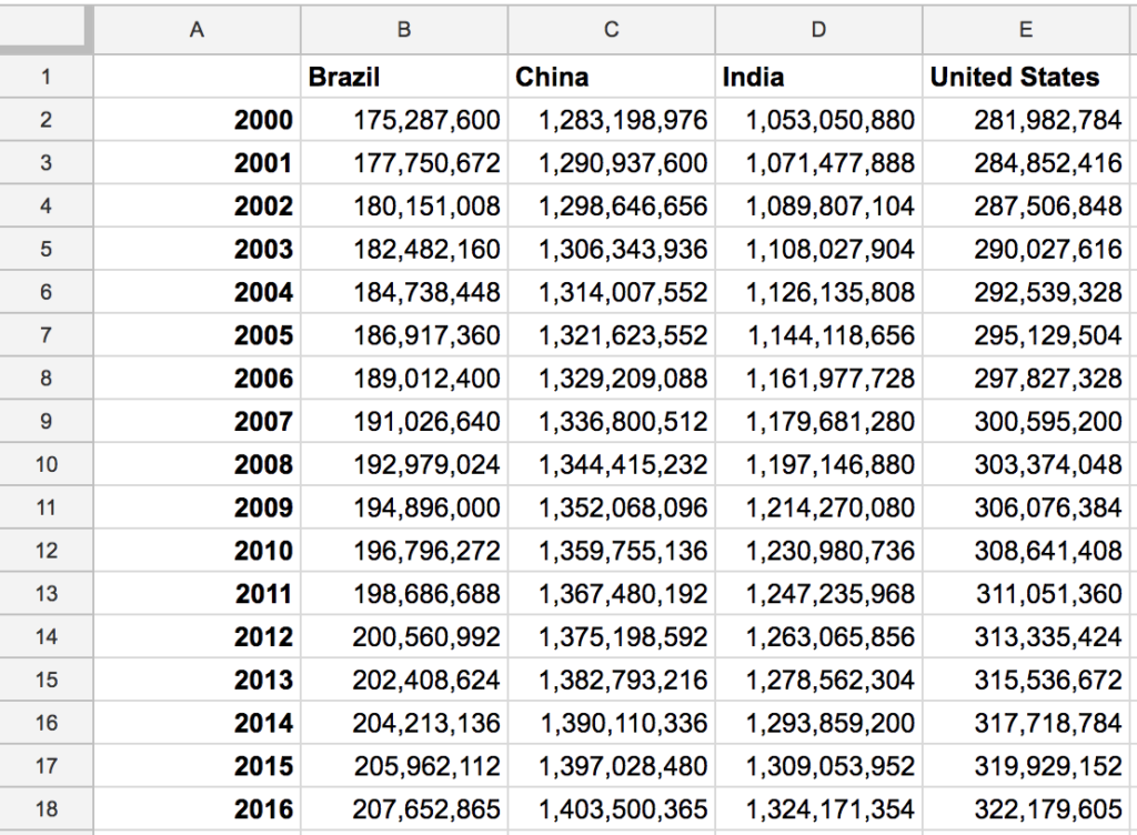
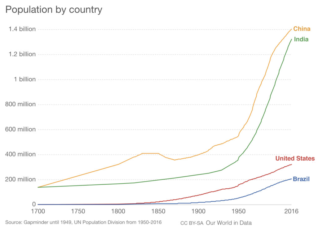
As an illustration, here’s the same data as a spreadsheet and as a line chart. Which one more clearly shows the fastest rate of population growth?
It just so happens that this visual mapping doesn’t work for people who can’t see. So, think of different mappings to make those trends and relationships explicit to people who need it, as another constraint in your user-centered design process.
Uncharted Territory
If I could, I’d just hand you a set of instructions, and say, “Follow these steps, and your data visualizations will be accessible!”
But that list of instructions doesn’t exist. You are going to help write it.
There are numerous mechanical techniques that you can use, from structured markup to color-contrast checkers. And there are different media you can apply, from text to sonification to animation to tactile feedback. There are general authoring principles in the W3C’s Web Content Accessibility Guidelines (WCAG), though precious little specifically about dataviz, and there are good articles you can read on applying those standards to data visualizations. And there are legal reasons to make sure you check those boxes. These are tools, but they aren’t the solution.
You can follow all the rules, and still make data visualizations that aren’t accessible and that don’t inform your reader. As a craftsperson your goal should not be the worst content you can get away with, it should be the best experience you can build.
Don’t look at this as a requirement, an obligation, another checkbox to tick off. Look at accessibility as an opportunity to hone your skills, to move beyond the ordinary, and to provide an intentional experience for your users.
Some of the most effective, emotive, and affecting data visualizations I’ve experienced have blended two or more sensory techniques together to make a rich data representation that stays with me, that motivates me, that means something to me. That’s a high bar to aim for, but even if your experiment doesn’t reach that mark, you’ll be providing a better experience for a larger audience. Don’t be afraid to innovate.
We are at just the beginning of accessible data visualization. Join the conversation with me and others in the Data Visualization Society, and let’s aim for that high bar together.
About the author: Doug Schepers (@shepazu) is the founder and director of Fizz Studio, an accessible data visualization startup in Chapel Hill, NC, USA. Fizz Studio creates hand-crafted accessible diagrams and a next-generation accessible charting platform. Prior to founding Fizz Studio, Doug was a project manager at W3C, where he developed standards and prototypes and launched the developer relations program. He believes in positive social change through building communities and interoperable open technology.